In April, we asked Iowa State University to honor Jack Trice by retiring his number or jersey and presented five planks for adding his legacy to the Iowa State brand. These stories pulled from centuries of influences and suggested simple steps that could provide a guiding touch for the century to come and beyond. One of the proposed additions was a chevron design inspired by Jack Trice’s uniform, as well as timeless symbols and petroglyphs from many millennia ago. Another proposal was the return of the missing Cyclone logo.
Along with these additions, Iowa State needs to finally decide between yellow or classic gold as the true representation of their school colors and the tale begins with Jack Trice.
_____________
Iowa State has been bedeviled by what shade of gold to use for nearly its whole history. After experimenting with colors such as purple, silver, and black, Iowa State College finally settled upon cardinal and gold in 1899, four years after the Cyclones nickname was first used by the Chicago Tribune. From the beginning, official programs, art, and apparel vacillated between various shades of yellow and gold.
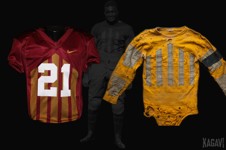
Evidence of this ancient indecision was seen in Iowa State’s choice to use gold for the Jack Trice throwback uniforms in 2013, despite Jack actually wearing a yellow jersey in the infamous 1923 Minnesota game. Further compounding the confusion, Iowa State’s licensed merchandise mimicking the uniform design used yellow instead of gold.
Relying on written accounts from Jack’s era gives no clue to the actual shade of gold or yellow used. Surviving letter sweaters often used gold rather than yellow, but the ubiquitous freshman beanies were yellow, not gold. It’s impossible to say which shade more accurately represents Jack’s time on campus.
Colleges simply weren’t that concerned with exact color shades and it showed.
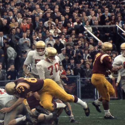
Some time after World War II as college football entered a prolonged period of prosperity and innovation, Iowa State settled upon actual gold as their school color. The 1959 Dirty Thirty team proudly rocked a close approximation of school colors and in similar uniforms two years later, the Cyclone football team traveled east to play Boston College, who was going through a color crisis of their own. (Iowa State is in white below.)
When the counterculture movement swept America, Iowa State apparently got caught up in the rejection of societal norms and tradition and sought to shake up their image by permanently moving away from gold, starting with some regrettable mustard and sunflower shades, before making the yellow even brighter during the 1980s. Along with avocado green and bright orange, yellow became a particularly popular home decor color during this period and discerning consumers could outfit their entire kitchen in yellow from the walls to the appliances to the floor.
A good overview of Iowa State football jerseys from this time period can be seen here (I also used their throwback jersey in the header image). This wouldn’t be the first or last time Iowa State was influenced by unfortunate fashionable trends and I stumbled across what could possibly be a rare image of the Iowa State designers that pushed the school away from gold to yellow:
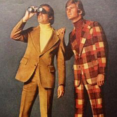
To be fair, the sixties and seventies were a weird time.
Cardinal and yellow (along with a healthy helping of white accents) solidified as the school colors with the dual successes of the greatest Cyclone football teams, as well as Johnny Orr’s basketball teams. On the surface it appears Iowa State shouldn’t move away from this recent tradition and should instead add a strong neutral color, such as the gray proposed in our previous story.
Upon analysis, the opposite appears true.
_____________
Color is known to evoke specific emotions in humans and savvy businesses have exploited this knowledge for decades. Generally speaking, colors can be separated into warm, cool, and neutrals. Any good design relies upon balancing these shades and it’s rare to find a brand that completely eschews cool or neutral colors.
Nearly every major school in the country has a neutral or calming color as one of their school colors. The only two exceptions are USC and Iowa State. The colors of red and yellow evoke USC in the minds of casual fans, given their colors have remained fairly stable from their first national championship in the 1920s onward–unlike Iowa State.
Perhaps Iowa State was attempting to copy USC on some level when they changed over to yellow in the late 1960s, which wouldn’t have been the first time they tried to snatch another school’s distinctive colors. In the 1930s, Iowa State football coach George Veenker had his players wear blue jerseys in order to emulate Michigan, but Veenker evidently forgot to copy the talent of Michigan’s players too.
Given how unique it is to have two warm colors, Iowa State has been unable to escape constant comparisons to USC’s much longer ownership of these colors, nor match their history of success, causing Iowa State to appear as a knock-off brand. While USC can rest on their vast laurels, Iowa State has to consider yet another problematic aspect of bright primary colors–the inescapable association with cheap fast food.
Research has suggested red and yellow stimulate appetite and excitement when used together, so the fast food industry has owned this specific color scheme for many decades with their garish signs tattooing the American landscape. There’s so many.
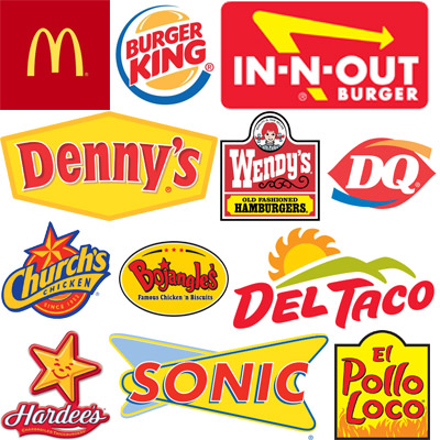
The association is so strong that the internet quickly took note in 2014 when McDonald’s sent a tweet praising Iowa State’s attempt at bright yellow and red alternate uniforms, releasing various mockups of Iowa State players as Ronald McDonald.
Fast food is disposable and an easy way to get some calories at a cheap price. This is also how opposing teams have historically treated Iowa State athletics–a cheap, disposable way to get an easy win with minimal fuss. During the largely hopeless 1980s and 1990s, imagine how the taste buds of opposing coaches salivated when they viewed the ketchup and mustard uniforms across the football field. (Of course, eating too much fast food can lead to food poisoning as Nebraska found out in 1992.)
Even McDonald’s, long the kingpin of garish, has realized that their traditional colors were outdated for modern sensibilities and appealing to the toddler set could only go so far. Many of their new store exteriors barely have a hint of red and yellow, opting instead for neutral and cool colors that evoke sophistication. Many other fast food brands have started to follow suit.
_____________
Iowa State has a long history of following the pack with branding choices and the use of yellow has exacerbated this problem. Typically major brands seek to boldly differentiate themselves from fellow competitors and color is one key way this is accomplished. Coca-Cola owns the color red, so Pepsi opposes with blue. UPS uses a traditional brown, so upstart FedEx shouts with orange and purple. Home Depot’s exciting orange is contrasted by the cool blue of Lowes.
It’s just good business sense to stand out.
Iowa State seems to have a firm grasp on the color yellow, yet their major instate rival Iowa also uses yellow and was already using it when Iowa State switched from gold. The third major nearby school, UNI, uses yellow as well. It is remarkably unusual for a school to rebrand itself with the color of a rival school, yet Iowa State chose this path. Imagine if Auburn voluntarily chose to change their orange to a crimson, or if Michigan State changed their green to more of a blue shade. Even UCLA has been very careful to use gold in their branding as a way to separate from USC’s ownership of the color yellow.
That’s not all. Surrounding states are overflowing with schools using yellow, not gold. Peer conference schools in the Big Ten and Big 12 also overwhelmingly use yellow, along with other national schools that use variations on the “cardinal and gold” theme. Can you even pick out Iowa State’s yellow color here, or the correct combo?
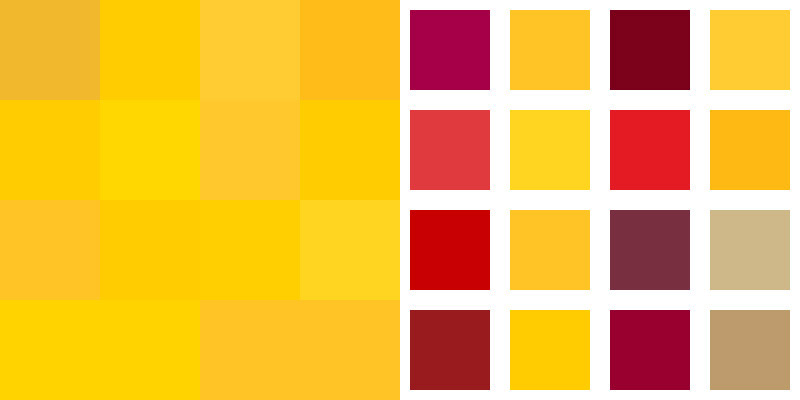
This really drives home how much similarity Iowa State has to deal with. Along with abandoning the unique Cyclone logo for a common cardinal bird mascot, abandoning a regionally distinctive gold color for a common yellow shade has hurt branding. Let’s look at the colors again, this time labeled:

Pairing classic gold with a somewhat reddish color is actually pretty rare nationally. If Iowa State reverted to gold, look at how it compares with the only other two peer institutions, Florida State and Boston College:
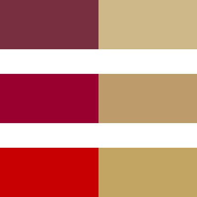
The Florida State and Boston College colors kind of blend together, but there is no confusing the distinctive blend of cardinal and gold that pops off the screen. Iowa State would be the only major school to boast this sophisticated color scheme, to go along with being the only school with the Cyclones nickname.
Since football uniforms are often the biggest and most visible way a school can brand themselves, how would this new color scheme appear on Cyclone uniforms?
_____________
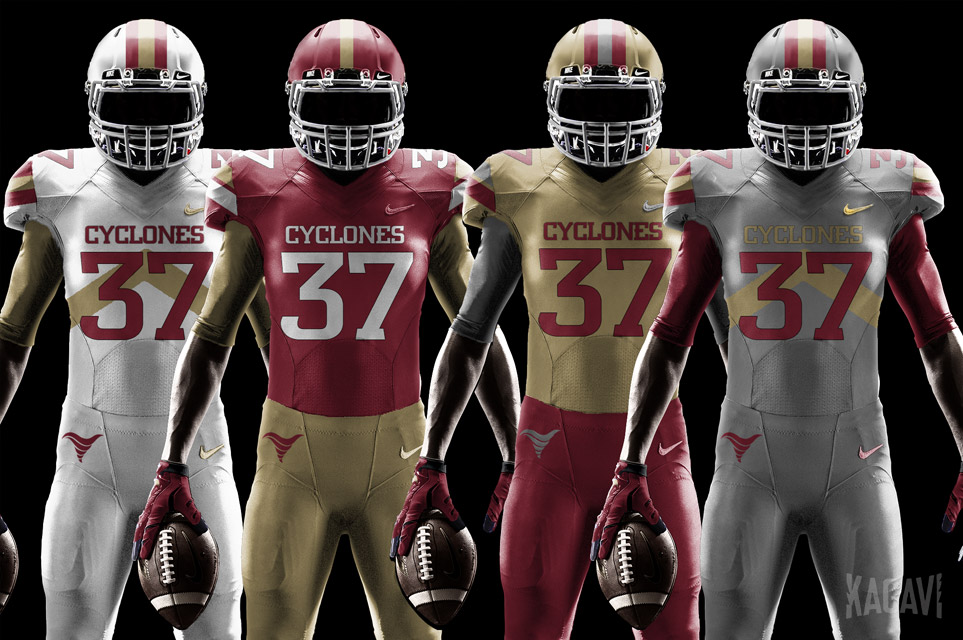
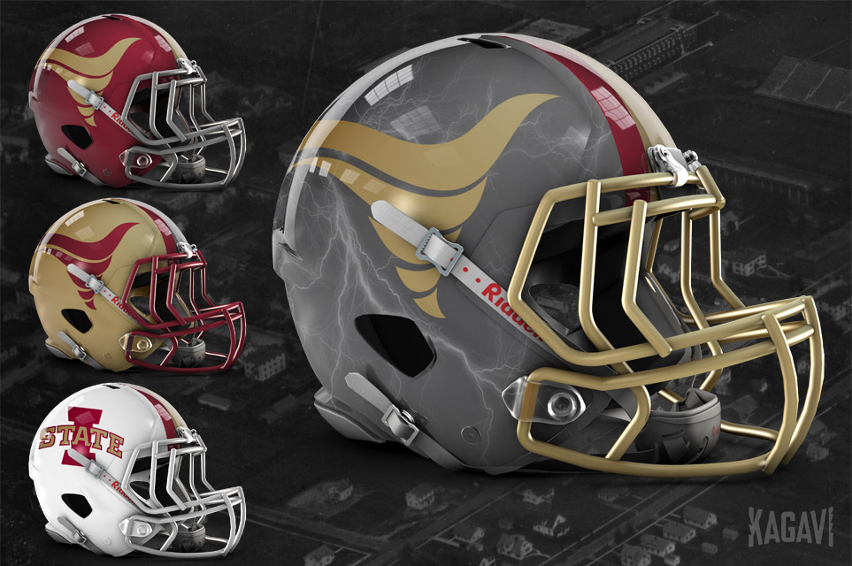
The jerseys that don’t have a chevron on the chest instead have it on the shoulders. The primary usage of a gold Cyclone logo mimics actual tornados that manifest in a ferocious mixture of gray clouds and tan, almost gold-like funnels.
Additionally, consider the iconic campanile tower, which was built just two years before the school colors of cardinal and gold were chosen. It stands as Iowa State’s most famous building, appearing on university rings and the official university mace. Jack Trice’s funeral took place underneath the pealing bells, the light gold bricks standing watch.
Walking through campus, the same three colors repeat themselves on building after building. Gold, gray, cardinal. The stately gray stone of Beardshear Hall and the cardinal brick of Alumni Hall. The three pillars of Iowa State. Buildings that have housed generations of students, representing what it truly means to be a Cyclone. (This wouldn’t be unprecedented either–Nike used iconic Michigan campus buildings in their recent rebrand of the athletics program.)
Here lies an opportunity to continue evolving Iowa State University by moving away from the common, confusing, cheap connotations that exist with the current red and yellow scheme, while reflecting the historical roots of Ames.
Cardinal, classic gold, and gray stand as the true colors of Iowa State University. It’s time to switch back permanently to gold and boldly position Iowa State as a global leader of the new millennium, unique in all aspects.